
Brutalism
in Colour
Christopher
Hope-Fitch
A fresh look at Brutalism
Photographer Christopher Hope-Fitch presents his spectacular long-term project ‘Brutalism in Colour’ as part of this year’s London Festival of Architecture (LFA).
This exhibition has now closed to the public. However, it is can still be viewed by appointment, please get in touch to arrange.
Featured as a ‘top pick’ for LFA in Wallpaper* and Stir World.
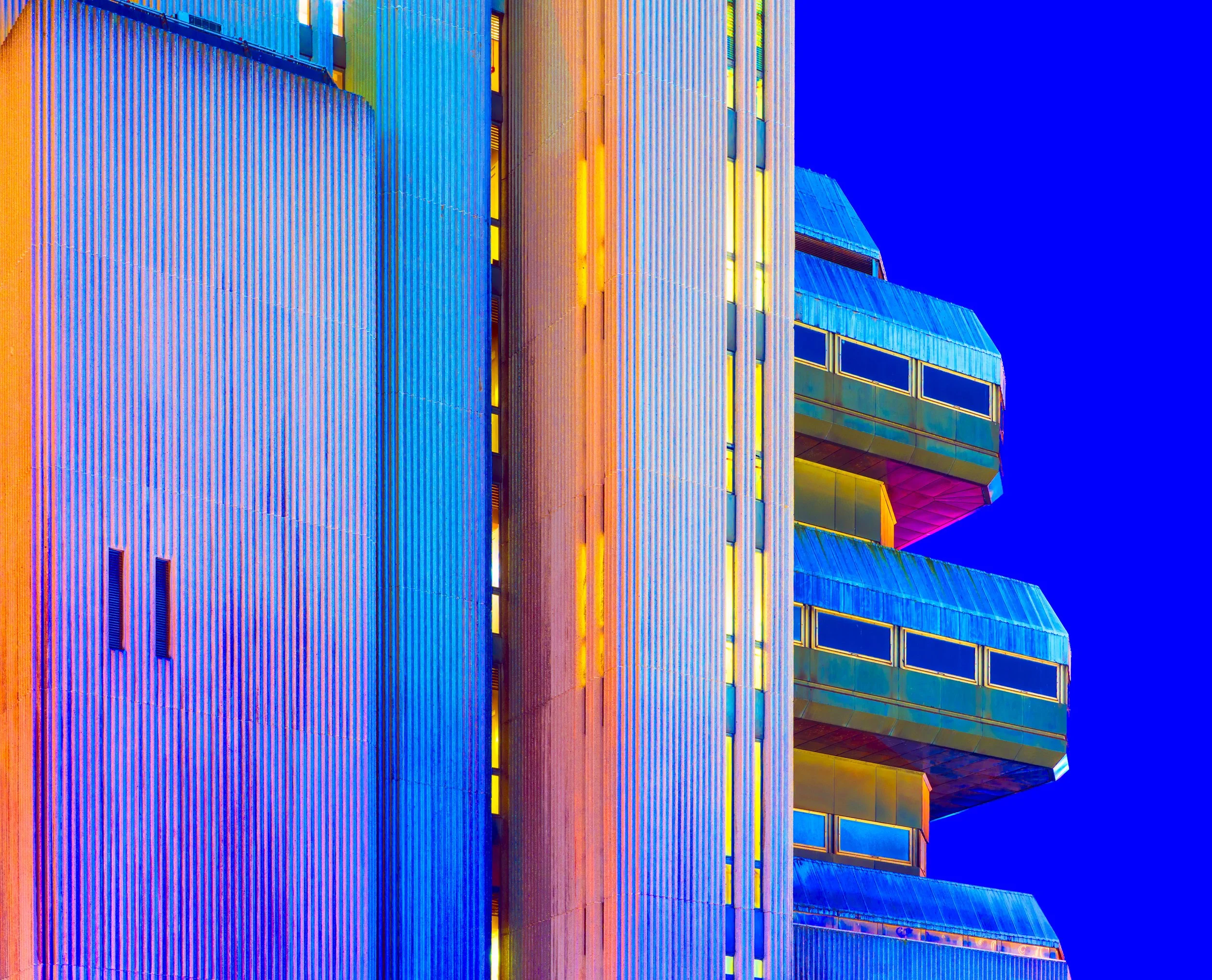
His vibrant photographs reveal the multitude of textures, geometries and hidden colours within brutalist architecture, encouraging viewers to revisit buildings they may have overlooked as bleak, grey and uninteresting.
The exhibition presents a selection of vivid images from over 100 locations, captured by Hope-Fitch during the last seven years. At first glance they may be mistaken for thermal images, but they are actually long-exposure night-time digital photographs. Bold colour variations come from different light sources and surfaces, amplified in post-production.
Brutalist buildings both iconic and lesser-known will be included – including the demolished Welbeck Street Car Park in London, by Michael Blampied and Partners, Coventry's disused Elephant Building sports centre and the threatened Museum of London building by Powell & Moya.
The long-term project is a reaction to Hope-Fitch's past experience as a professional monochrome hand printer. His project is influenced by the supersaturated work of Italian Giallo movie directors such as Mario Bava and Dario Argento.
With thanks
Graphic design and identity Tim George
Documentary film Michael Shilling
Frames Nielsen
Print media Permajet
Opening reception drinks Forest Road Brewery


About the artist
London-based Christopher Hope-Fitch began his career as a professional darkroom hand-printer working initially in monochrome and then colour.
For the last decade has worked as a freelance photographer. His personal photography projects are strongly influenced by his traditional training and strong interest in architecture.
New!
Brutalism in Colour
photobook
Limited-edition publication to accompany our latest exhibition Brutalism in Colour.
This 48-page book features a lustrous iridescent cover and heavyweight 160gsm Fedrigoni Splendorgel pages.
The book includes essays by RIBA Journal deputy editor Jan-Carlos Kucharek and editor Gareth Gardner – not to mention a wide selection of eye-popping colour images by Chrisopher Hope-Fitch.
First edition limited to 150 copies. Price £20.
Special edition of 10 copies, includes 8”x10” print of the National Theatre.
Price £85.
Special edition of 10 copies, includes 5”x7” print of Welbeck Street Car Park.
Price £45. SOLD OUT
Designed by Tim George with essays by Jan-Carlos Kucharek and Gareth Gardner.
PLEASE NOTE
Due to VAT arrangements, book purchases are made via our Stripe site and unfortunately cannot be added to the main shop basket/checkout.
Please get in touch should you require further assistance.


Brutalism in Colour
Special edition book plus 8”x10” print
£85


Brutalism in Colour
The book
£20
Watch the film
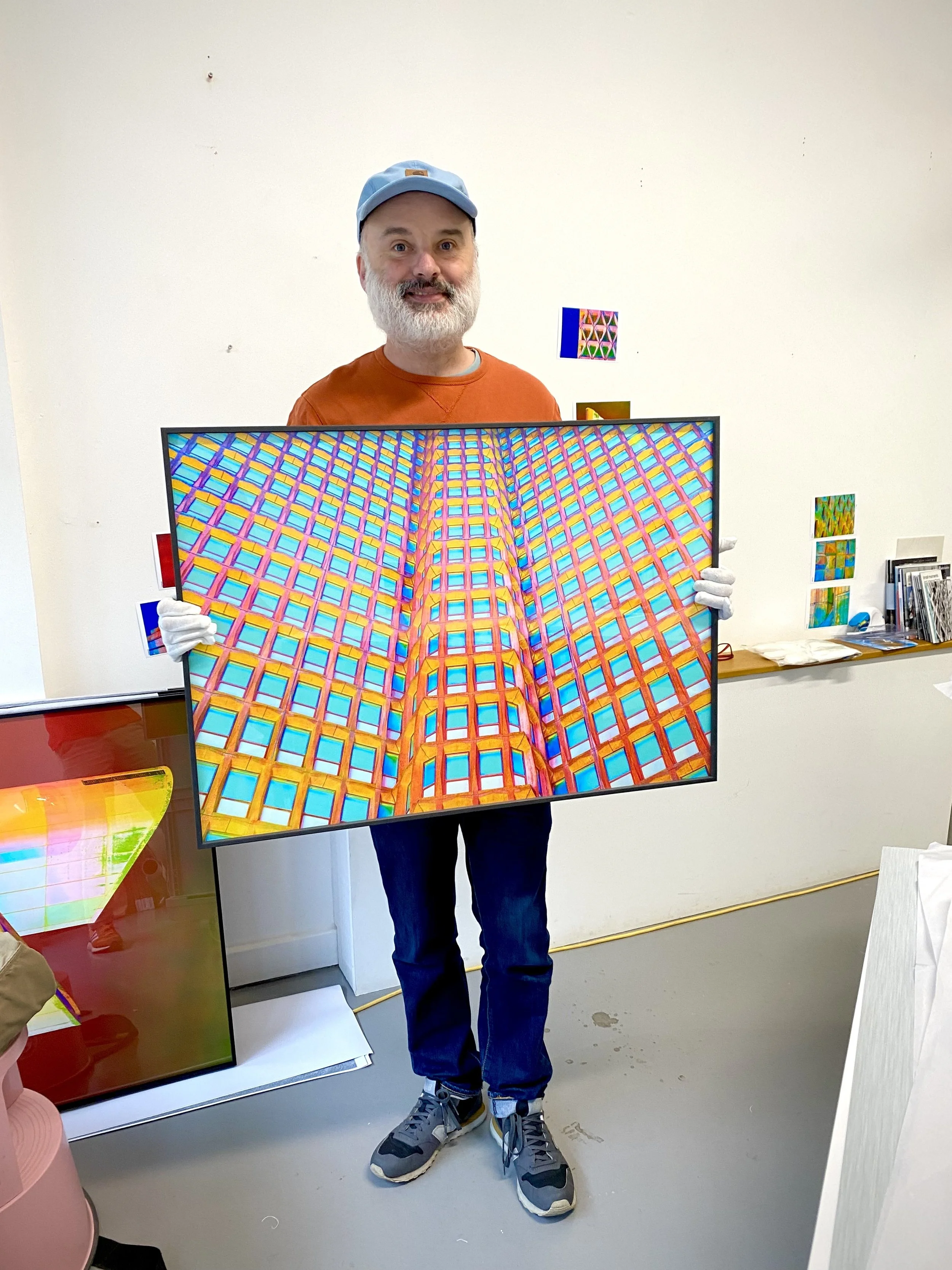
Photographer and videographer Michael Shilling has created a documentary about Christopher Hope-Fitch to accompany the exhibition Brutalism in Colour.
He travelled to Bristol with Christopher, documenting the photographic process involved in creating the vibrant images.


Further reading
-
What is #Brutalism without Instagram?
For a decade Brutalist architecture has been wildly popular on the social media platform. Its graphical qualities, frequent dereliction and nostalgic atmosphere tick all the right boxes for Insta addicts. Moreover, Béton Brut looks great at 1080 pixels.
In its wake have come long-form personal projects and a multitude of chunky photobooks. The boom began with the rediscovery of outlandish – and often intimidating – concrete structures throughout former Eastern Bloc countries.
These explorations – including Christopher Herwig’s Soviet Bus Stops (2015), Roman Bezjak’s Socialist Modernism (2011) and Spomenik by Jan Kempenaers (2010) – frequently adopted a similar tone in their use of flat-light colour photography. Frédéric Chaubin’s 2011 tome CCCP, graphically inspired by Soviet propaganda posters, helped to set the macho mood for what followed.
An inevitable re-appreciation of British Brutalism stimulated a cottage industry of gazetteers and reference books, often with monochromatic photographs plus the inevitable muscular typography. This overall butchness reminds us that Brutalist architecture was almost entirely designed by men and has been rediscovered (with a few exceptions) by male photographers.
The masculinity of these contemporary images starkly contrasts with many of the photographs commissioned by architects and publications when the buildings were originally completed. Documentary photographers such as Roger Mayne (at Sheffield’s Park Hill), Tony Ray-Jones (Deptford’s Pepys Estate and Thamesmead) and Sandra Lousada (Robin Hood Gardens) found the humanity within these uncompromising buildings.
Brutalism in Colour provides a different perspective, encouraging us to look beyond the overfamiliar tropes. The vibrant images transform familiar structures into abstract forms reminiscent of Paul Catherall’s colourful screenprints or the graphical paintings of Patrick Caulfield.
Christopher Hope-Fitch says that he is influenced by the saturated cinema of Giallo directors Dario Argento and Mario Bava. Argento’s 1977 masterpiece Suspiria was one of the last Italian Technicolor movies, utilising the same dye transfer process used to print William Eggleston’s similarly unsettling and cinematic photographs. Saturated colour has long been deployed to perturb and discomfit in both movies and stills. Think of Nicolas Roeg’s cinematography for Roger Corman’s The Masque of the Red Death (1964) and his own Don’t Look Now (1973), or the blackly comedic documentary images of Martin Parr and vividly intimate Cibachrome snapshots by Nan Goldin.
Hope-Fitch doesn’t unnerve in the same way, but he still discombobulates us, rendering the familiar (and often cliché) as peculiar and mysterious. Exaggerating and transforming colours – delivering neon greens, fluorescent yellows, electric blues and delicate candy pinks – dials down the macho and replaces it with something more surprising.
His work invites us to look again at buildings that we might think of as grey and dreary and rediscover their magical fabulousness.
Gareth Gardner
Curator
-
London-based Christopher Hope-Fitch began his career as a professional darkroom hand-printer working initially in monochrome. For the past decade he has worked as a freelance photographer for Getty images and the RIBA.
Hope-Fitch has always lived in Croydon and its environs, and his earliest experiences of Brutalism were the town’s towers and car parks. His father, a surveyor for the Greater London Council, would often point-out interesting structures and introduced Christopher to the shuttered concrete at the National Theatre, designed by Denys Lasdun.
Christopher’s Brutalist photographic journey began on film, shooting in black and white, a treatment that has subsequently become ubiquitous for this type of architecture. However, he soon decided to broaden his approach, initially using infrared film, creating a series of images that were published by the British Journal of Photography .
Christopher revisited the project after moving into colour printing, and experimented with long exposure colour analogue night- time photography, which he discovered exaggerates the colour temperature differences of disparate light sources.
The approach really came into its own with advances in digital photography and sensor design. The colour depth captured by Christopher’s full frame Sony camera allows him to record an enormous range suitable for post processing, with the ability to lift shadows while retaining colour information.
Christopher plans to continue with the project, visiting further locations around the country, and ultimately overseas.